UX meets visual communication
News
What James learnt from going back to school
User Experience (UX) Design is my bread and butter. It has been for quite some time now. The thing is; I also have a passion for art and design. You know. Paintings, furniture, architecture, graphics et cetera et cetera. I took Art at A-Level and, as well as studying Anthropology – to which I owe my entry into the world of UX – I minored in Visual Culture. My time at a design agency, though, has essentially meant this interest of mine grew into a significant itch. I realised I was craving more practical design experience. The print it out, cut it, get your hands dirty kind of design experience.
If you’re reading this and that voice in your head is muttering, “Hang on, mate. Visual design and UX aren’t that different” Yes, yes, I know; they’re two sides of the same coin. That’s why it makes sense, right! It makes sense to develop a new(ish) design vocabulary and not only scratch that itch but grow as a designer and bring a set of skills to Yoyo. So, I took myself off to university (again…) to study Visual Communication at London College of Communication (LCC). And, before I go any further, I cannot thank Yoyo enough for allowing me the flexibility to work on a part-time basis during my studies. It would not have been possible without the team’s support.
Now, visual communication sounds pretty broad, right? True.
The course, which lasted eight months, covered the foundations of all things design. We explored everything from typography and colour theory to visual language and grammar, dunking our heads into the likes of editorial, exhibition and digital design. The list goes on. Aside from the academic and practical aspects of the course, though, I was able to take advantage of LCC’s facilities and immerse myself in the world of print and learn a range of different softwares. Think Indesign, Blender and a couple in-between. It was refreshing to move away from Figma for a bit and discover what’s possible on some powerful tools.
Although these areas of design are all closely related it certainly felt as though, at times, I was deviating from my role as a UX designer.
This was not the plan and my goal was to apply my new learnings to my existing practice. What came as a surprise, however, was that I would need to do some un-learning first. When given assignments, the UX design-conditioned part of my brain would default to the application of a strategic and user-centred design methodology rather than a visual research and conceptual approach which largely centres on a variety of reference points. Don’t get me wrong; in each case the audience remains front-and-centre, but a key takeaway for me was that visual communication requires a nuanced perspective. An attunement to culturally relevant signs and symbols as opposed to usability. This understanding, paired with solid UX, makes for a truly impactful outcome.
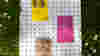
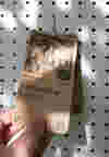
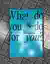
I cast the net wide, absorbed as much information as possible and loved every minute of it. But I knew I wanted to bring everything together and channel my new-found skill set towards what Yoyo do best, brand and digital. With this in mind, my final project involved the creation of an identity for a brand called ‘Hobby’. Inspired by creative health and social prescribing, my concept centred around connecting people with creative opportunities in their local community. The identity, and brand name itself, drew on the seemingly outdated term ‘Hobby’ (its usage peaked in the 1940’s), visual references from vintage toys, and archival imagery. With a particular focus on typography, layout and imagery, I was keen to develop a flexible brand system that could be applied across various notional applications.
There are naturally things that I would have done differently and I recognise I still have a way to go to be the designer I want to be but I enjoyed the challenge of creating a brand and product concept from scratch. Writing the brief and executing it within a short period of time felt like a big achievement in itself. I digress… I’ll stop talking and let you take a peek at a pinch of the project’s outcomes.
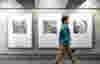
It’s not a new thing to talk about how UX extends to the physical world – that’s where it ultimately started. But the experience of designing for print and experimenting with different mediums has reinforced a key aspect of design which I feel tends to fall to the wayside online.
The physicality of printed matter challenges you to closely consider how the user interacts with objects and the embodied experience of design. How you turn a page, how you scroll or what mental models you conform to or challenge, for instance. Asking these questions not only positively impacts accessibility and the consideration of how a variety of users experience your designs, but it’s also worth mentioning the environmental impact. What about the materials you use? How might you reduce waste in production? These challenges and their solutions are interrelated and they are not solely experienced by one area of design. Ultimately, it is the role of the designer, whichever field(s) they hail from, to consider their impact beyond the aesthetics of their designs.
Let’s not forget that it’s got to look cool too.
Read more...
View all work
News
The Hidden Footprint: Why green hosting is a mission priority
Discover the hidden environmental cost of your website and learn why switching to green hosting is a critical step to fully align your charity's digital presence with its ethical mission.