Marie Curie
Campaign / UI / UX / Development
It might be the great leveler that comes to us all, but death remains one of the most difficult conversations.
For those affected by bereavement, however, the ability to open up and share the powerful, painful feelings that grief brings can be an incredibly helpful step in the healing process. Marie Curie, which cares for people with terminal illnesses, chose Yoyo to help them find a way. They envisioned a digital space where stories of loved ones could be told and memories could live on, opening the door to their support services for anyone coping with bereavement.


We needed a physical, tangible record of the memories of our loved ones, forever.
The challenge
For Marie Curie, this was a project that had to resonate with anyone affected by grief and not just those connected to the charity, placing real emphasis on an understanding of the audience in question. During the discovery phase, we gained valuable insights from people who had lost someone within the last five years, and combined this with output from research workshops held with key stakeholders across Marie Curie. What emerged was the concept for Memory Cloud, providing a simple, engaging and powerful experience for users and an evergreen platform for Marie Curie to raise awareness of their services and promote their role in helping people deal with grief.

After the initial meeting with Yoyo where they shared the concepts, we were so excited about working with them, their ideas were creative, unique and they really experimented to understand how far they could push the boundaries.

The challenge
The design process demanded a sensitive approach given the personal and highly emotional nature of the site content. All elements needed to come together to create a visual experience that would captivate users while being sympathetic to their emotional state. As well as creating this comforting, trusted space, we were also challenged to subtly incorporate the Marie Curie brand on the page in a way that would maintain the site’s broad, inclusive appeal.
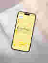
Sitting at the heart of the design concept is the daffodil. With an echo of the Marie Curie logo, it provided the inspiration for a colour palette of warm yellows and soft golds that help create a soothing atmosphere alongside the fluid graphic builds. The gentle falling motion of the animated flower petals – each one symbolising a lost loved one – adds to the sense of visual depth and pulls users in, while the sensory nature of the experience is amplified by the accompanying audio soundtrack, which was selected to strike precisely the right tone.


Augmented reality launch campaign.
Ahead of its wider launch to the public, the site was introduced to Marie Curie staff at a key internal event, which takes place once every three years. To tease the Memory Cloud concept, we used our expertise in Augmented Reality to create a complementary AR experience where audience members could unlock a beautiful interactive petal animation on their mobiles. This contained a message encouraging staff to share their own precious memories of lost loved ones within Memory Cloud, breathing real-life stories into this important campaign.

- Page visits
- Monthly page views
- New users
- Bounce rate
- 200K
- 23,000
- 130K
- 5%
